Pantone’s Top 10 Colors for Spring 2016
A Transporting and Transformative Canvas
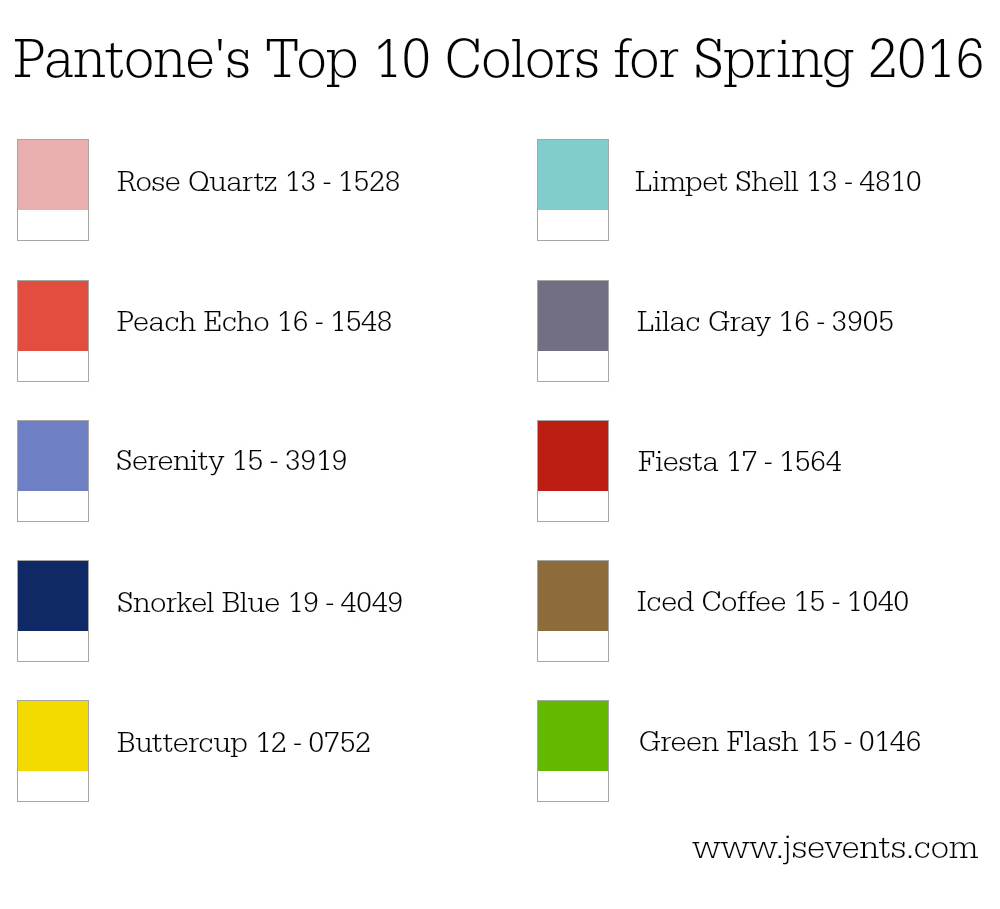
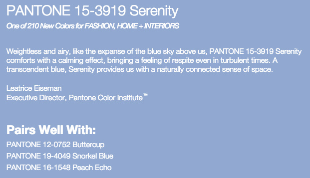
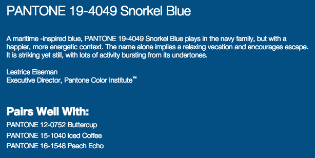
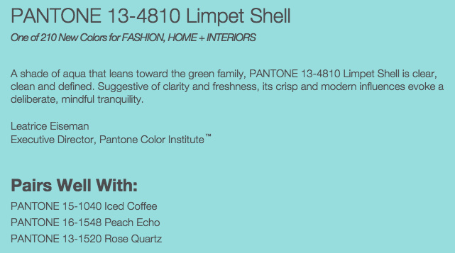
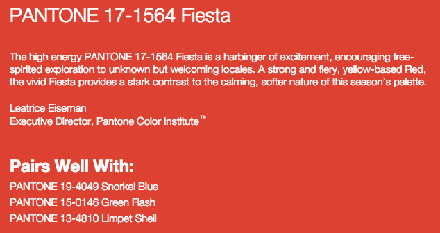
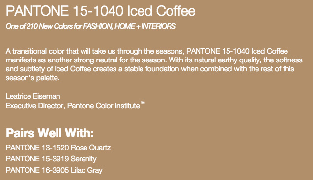
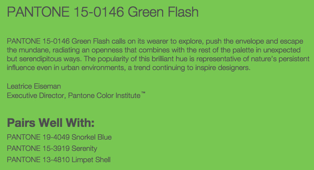
Pantone’s top 10 colors for Spring 2016 have been revealed and the palette is a wonderful mix between calm and energetic, cool and warm, soft and vibrant.
“Influenced by the world of art, new global doors opening and the desire to disconnect from technology and unwind, designers this season have gravitated toward a palette that is first and foremost calming. Paying homage to the beauty of natural resources, colors emerging in the Spring collections serve as vehicles that transport wearers to more tranquil, mindful environs which encourage relaxation first, followed by curiosity and exploration.”
Colors this season transport us to a happier, sunnier place where we feel free to express a wittier version of our real selves… and I couldn’t agree more with Leatrice Eiseman.
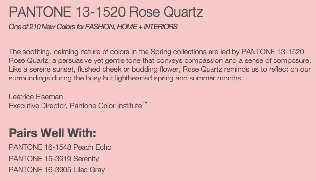
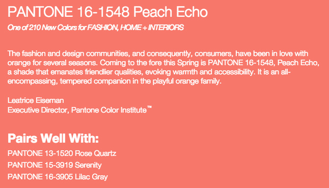
Take a look at these wonderful colors and make sure to check back soon for a more in-depth look at each color and how you can incorporate them into your own wedding.
Which color is your favorite? I’ll tell you mine: Limpet Shell all the way.




Leave a Reply
Want to join the discussion?Feel free to contribute!